A Digital Product Designer with experience in
UX Design, UI Design, and Web Design
Sì Design Agency

Type
Independent work
Lenght
In progress
Role
Art Direction
UX Design
UI Design
Platform
Responsive Website
Brand Identity
Design System
Problem Space
I'm currently collaborating with SìDesign, a dynamic digital agency specialising in graphic design, illustrations, and video production to shape and elevate their digital presence. With bases in Venice and London, tailored for a youthful and vibrant audience, the design seamlessly integrates innovation, style and a playful vibe to leave a lasting impact.
See the interactive prototype or read the design steps I followed below for more insight.
Moodboard
SìDesign is:
dynamic, youthful, vibrant, and playful
In order to create a moodboard, I researched images that visually represented these adjectives.

Colours

The Moodboard inspired my colour palette.
In choosing the colours, I tried to keep evoking a sense of playfulness mixed with sophistication.
The predominant use of White wants to convey a clean aesthetic, serving as a canvas for creativity.
Purple and Eerie Black add an element of depth, creating a visually captivating experience.
Lastly, this bright Celeste and touches of Lavender pink and Jasmine yellow inject warmth and playfulness adding some contrast that sparks creativity and optimism.
Typography

I decided to used two fonts in my project.
Playfair Display Bold: its bold and distinctive letterforms make a strong visual statement perfect for headings, complementing the vibrant and youthful theme.
Montserrat Regular: its versatility ensures readability while maintaining a contemporary and energetic vibe.
Logo

The logo aims for simplicity, drawing attention to the word "sì" that reflects the agency's half-Italian roots.
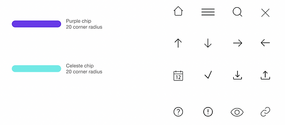
Employing the same typography as the entire project, a touch of flair is introduced by a vibrant, rounded chip positioned beneath the word "sì" for emphasis. Both the text and the chip adapt their colours to harmonise with different backgrounds.
Iconography

After defining my colours and typography, I started working on geometries and the iconography to start building my design system.
The iconography, characterised by very thin lines, embodies a minimalist and sophisticated aesthetic.
Wireframes
I started conceptualising the final product through sketching various ideas on paper.
I selected the most promising concepts in a final wireframe and translated it into a mid-fidelity mockup using Figma that I then tested with potential users.


Design System
I then kept building on my Design System, adding components I could use to create my high-fidelity design. I did this following the principles of Atomic Design.
Here are some examples or click to view the complete Design System (in progress).


Hi-fidelity Design
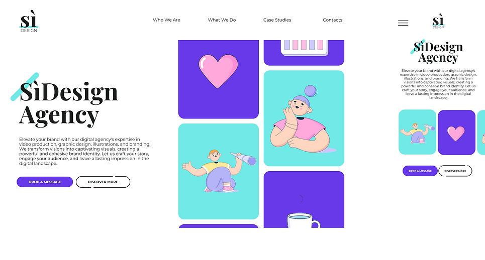
With my Design System ready, I was finally able to create the final hi-fi design of my website in Figma.
Here are some examples or click to view the prototype.
Home page (desktop and mobile):

Contact form:

Key takeaways & next steps
This was such a cool project to be working on. Collaborating with other creatives was so much fun throughout the duration of the whole project. It was refreshing not to worry about strict business rules, or constraints on colours and the number of animated illustrations. We could really go bold with the design, matching the agency's playful and youthful spirit.
The next steps will be to complete the design system, considering potential future integrations as the agency expands.
Then I will be actively assisting developers in bringing this website to life.
I'm looking forward to testing the performance with futures users and clients for future improvements.